There’s a saying in the world of design:
“Good typography goes unnoticed, you just feel that something is right.”
And it couldn’t be more true.
The fonts you choose, the line spacing, the size of your headings, and how elements appear on the page aren’t just about looks.
Typography guides the viewer, sets the mood, and can even determine whether your brand feels professional, or not.
A Real Example and A Typographic Nightmare
Not long ago, I took over the maintenance of a website. Not long after, I got a message:
“Could you do a little redesign? It just doesn’t look nice somehow.”
As soon as I logged into the backend and looked through the pages, one of the main issues became obvious:
- Six different fonts used across a single page
- Headings in all sorts of sizes, some thin and italic, others bold and all caps
- The text was hard to read on mobile
- And worst of all: nothing stood out, because everything was trying to
The result?
A big, visual mess.
The site was trying to be serious, feminine, friendly, and professional all at the same time, so in the end, it didn’t communicate anything clearly.

What to Keep in Mind If You Want Clean, Trust-Building Typography
1. Clear Hierarchy Is Key
Make sure there’s a logical difference between your main heading, subheadings, body text, and highlights.
For example:
- H1 (main title) – large and bold
- H2 (subheading) – slightly smaller, but still strong
- Body text – easy to read, around 16px is usually ideal
A clear hierarchy helps guide the reader’s eye and keeps your content from feeling cluttered.
2. Don’t Use More Than 2 Fonts
One typeface for headings and another for body text is more than enough. For instance:
- A sleek, thin sans-serif for headings
- A friendlier, rounder font for body text
Mixing too many fonts can quickly feel chaotic, even if each is beautiful on its own.
3. Breathing Room Matters
When your text is crammed together, it’s exhausting to read. Proper line height and spacing make all the difference.
White space isn’t wasted space, it gives your content room to shine and makes everything feel more intentional.
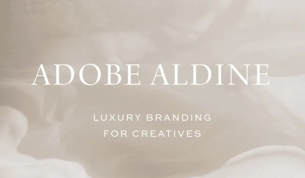
4. Fonts Have a Mood, Just Like Your Brand
A playful, handwritten font won’t make you look like a trusted advisor and vice versa.
If your brand is soft, minimal, or elegant, your typography should reflect that same energy.
Let your fonts support your message, not contradict it.

What I Learned from This
During the redesign I mentioned earlier, the very first step was cleaning up the typography:
- We selected two consistent fonts
- We created a clear heading structure
- We reviewed what the site owner actually wanted to highlight
- And we gave the text room to breathe
Even with just this one change, the site already looked far more professional and we hadn’t even touched the colors or images yet!
Typography Isn’t Just About Pretty Fonts
It’s one of the most powerful visual tools in your online presence.
When used well, typography builds trust, guides the reader, and reinforces your brand message.
So if you’re planning a new website or thinking of refreshing your current one, don’t overlook the fonts.
Because your style doesn’t start with a color or a layout.
It starts with the way you write and the way your words look on screen.